Tuesday 10 November 2009

Film Opening - Final Edit

L3 OPENING SEQUENCE - GROUP 1 - FINAL VIDEO from cmdiploma on Vimeo.

This is the final edit for my film opening, which I am quite pleased with. However If I had more time I would have done more with my titles, for example adding the same effects on the main title as the other titles so they don't just fade in and fade out. Although I think I did well in keeping it simple and abstract which was my plan to begin with.

Monday 9 November 2009

EVALUATION - Activity one

In what ways does your media product use, develop or challenge forms and conventions of real media products? (i.e. of film openings)

Here is a 9 frame grid for my film opening 'Something Wicked'.


The nine frame grid shows shots I feel best repersents what I was trying to achieve.

Frame 1
This is the first shot that appears on screen (excluding the production logos). It is the establishing shot which sets the scene and builds up the atmosphere, as the audience may be wondering where the location is and what relevance it has.

Frame 2
Frame 2 is shot through a green house window, and shows leg shots of a girl walking along the garden path. I particularly like this shot as its unusual and makes it look like the girl is being watched.

Frame 3
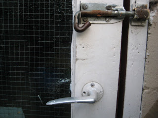
This shot is a close up of the shed door, I think the rusty pad lock adds to the effect of the film opening and creates an uncertainty of what might be inside. It also has a contrast of the colours used in the rest of the opening, as later shots become darker.

Frame 4
This frame shows where the Main title comes in. I used decorative/eroded/old styled font called Kingjola, from dafont.com. This is a common font type to have in supernatural thrillers, as I found out whilst planning and looking at exsisting film openings such as Rosemary's baby,where such font is used. In Final Cut Express I added effects to the main title which included, Gaussian Blur, Earthquake and Directional which makes it shake about on the screen, which I feel really adds to the atmosphere.

Frame 5
A tracking shot is used here, moving from left to right showing close up of props.

Frame 6
I used this frame as it is a good example of the font style used and it also shows how we gave credit to the composer of our soundtrack (which was in the terms of use). The font is called Kingjola and can be found on dafont.com. However in Photoshop I edited it a bit to fit more with what I wanted it to look like.

Frame 7
This shot has been included in the grid as its the shot where 'action' comes in. The 'action' is hand shots of hands rummaging around and finding the significant item - the book.

Frame 8
This shot shows the significant item being found, which is important to the rest of the plot in the film.

Frame 9
This is the very last shot in the sequence. It is also the last title that appears in the opening which reads 'Directed by ...' this title along with 'Produced by ...' (seen in frame 7) come in last as they are the more important titles in an opening. Directors such as Tim Burton also places these two titles last in their film openings.

EVALUATION - Activity two

How does your media product represent particular social groups?

My film opening has no introduction to characters as such and only hand and legs shots are shown of the main character. This was a choice made to keep the opening atmospheric and to maintain the tension build up of who this character is and what importance they have to the film.
However I would compare this character to Mercedes, the little girl from the film Cronos (Del Toro, 1993)


The reason I would compare the character in my opening to Mercedes is because she co-finds the significant item in Cronos and is affected by the events that happen because of the item later in the film. For example, she see's her Grandad become youthful yet crave the need for human blood.
This is simiular to the character in my film opening as the character in Something Wicked finds the significant item and the events that take place because of it affect her as well as others.

EVALUATION - Activity three

What kind of media institution might distribute your media product and why?

Here is our Film Opening sequence with myself and Angelica talking about film production and the influences we had for the project. For example a possible funder for our film opening could have been from the BBC Microwave project, or film 4.

EVALUATION - Activity four

Who would be the audience for your media product?

This is Jessie James.


Jessie James is a stereotypical target audience for our film opening.

Jessie is a 24 year old female living in a flat near the city center.
She wears casual jeans and t-shirts and studies Media at Uni.
In her spare time she socializes with friends down the pub and spends her money on rent, food, CD's and DVD's.
Her favourite film is Pulp Fiction and she peferes to watch films on the big screen at the cinema with her friends.
Her favourite tv programmes are Charmed and Buffy the Vampire Slayer re-runs (They both have a supernatural feel) also Friends and Scrubs - typicial american comedy.
She also has a pet cat and likes to listen to indie music whilst on social networks such as twitter.


The images in the picture show Jessie James in the middle of the page with icons of her favourite things and things that represent her around the edge.

EVALUATION - Activity five

How did you attract/address your audience?

Here is a screen grab from Youtube, where I have been making annotations to my Film Opening.


This is the Video with annotations. The annotations relate to my target audience and how they would react or enjoy particular parts of the opening.

EVALUATION - Activity six

What have you learnt about technologies from the process of constructing this product?

This picture represents myself and Angelica using the equipment we needed for this project.
You can click on the image for a larger size, which is easier to read.


This picture shows all the programs and websites we used during this project, again you can view the image in a larger size by clicking on the picture.

EVALUATION - Activity seven

Looking back at your preliminary task (the continuity editing task), what do you feel you have learnt in the progression from it to full product?

As there is no dialogue in my film opening, the rules Match on Match Action, Shot/Reverse Shot and The 180 Degree rule do not apply. However one thing I did use from the Perliminary task was to introduce the character before hand. e.g. in the Perlimary task you see the charcter before they open the door so that the audience has already been introduced to the character and are not confussed by the second shot of someones hand opening a door.


The same thing applies in our film opening when you see leg shots of somebody walking towards the shed, this is so that later on in the opening the audience isn't confussed by the random hands rummaging around props inside of the shed.

Saturday 7 November 2009

Script for Voice Over Commentary

Angelica: Hello I'm Angelica


Christina: and I'm Christina, we produced and directed the opening to ‘Something Wicked’


Angelica: The production logo’s at the beginning of the video represent the funding and creation of this film. Long Road sixth form college was the funder and distributor of the film donating around £40,000 for us to work with. Underwater Cow and Jellycar productions were the producer companies we used.


Christina: Other possible funding for our film could have come from the BBC microwave project. The microwave project is for London-based companies to produce ten micro-budget feature films over a three year period. Another funder or distributor in mind was film-four.


Angelica: The titles in the film opening appear in order so that the more important titles come in last. ‘Something Wicked’ appears when the soundtrack becomes more sinister which is effective because it highlights the importance of the title.


Christina: Two film openings that reflect supernatural conventions that we had looked at are Rosemary’s baby and To Kill a Mockingbird. These films influenced us in different ways, in particular the style of font used and the soundtracks.


Angelica: Rosemary’s Baby was produced by William Castle productions and was distributed by Paramount Pictures, however To Kill a Mockingbird was produced by Brentwood productions and distributed by Universal Pictures. This shows how there is a variety of producers and distributors in the thriller genre.


Christina: The certificate we advise the film to be set as is a 15. This is because of the supernatural thriller aspects of the film, which would not be suitable for young people.

Certificate

I went on the SBBFC to look at certificates for films.
This talks about what makes a film a certain certificate.
Under the category '15' it states:

What sort of issues might I find in a ‘15’ film, DVD or video game?


‘15’ works are stronger than '12' or ‘12A’ rated works and could include any of the following:

• strong violence
• frequent strong language (eg 'f***').
• portrayals of sexual activity
• strong verbal references to sex
• sexual nudity
• brief scenes of sexual violence or verbal references to sexual violence
• discriminatory language or behaviour
• drug taking

Occasionally there may be uses of the strongest terms (eg 'c***'), although continued aggressive use will not normally be passed at ‘15’. For more detailed information on the ‘15’ category click here to read the BBFC guidelines


What about horror works?

At’15’ there can be strong threat and menace (as long as it is not sadistic or sexualised), although the strongest gory images are unlikely to be acceptable.


I think this relates to my film opening and I would therefore give it the certificate 15.

Friday 6 November 2009

Changes to Rough Cut

The changes I made to my rough cut today included:

Adding titles.
I added the rest of my film opening titles into the sequence, adding a fade effect on them so they fade in and out to flow with the rest of the film.

Moving the main title.
I moved the main title further along the timeline, so that when the strings come in on the soundtrack the main title appears. This change was made so that the main title has a more dramatic feel to grab the attention of the audience.

Re-touches.
I did a few re-touches on some clips to make fades smoother, and less jumpy in the sequence.

Rough nine grid frame

For my opening evaluation.


Finished Film Opening


Today I finished editing my film opening on final Cut Express
It was mainly just making finishing touches such as, making the cuts between clips fade right and adjusting the titles around the sequence.

There was only one problem that occurred today, which concerned the titles.
As I had moved the main title further along the timeline, there was less time to have the other titles appear.
I over came this by getting rid of one of the cast names title at the beginning of the sequence and adding the 'Directed by' title at the end of the sequence.


Wednesday 4 November 2009

Comic Book Opening

In Tuesdays lesson, Angelica began to create her images for her comic book effect opening.
She had taken photo's of her main character she wanted to introduce in the opening and began to edit them on Photoshop. There was a problem that occured during this stage as the background contained lots of different colour shades etc so it was time consuming getting rid of everything in the background. I had suggested to Angelica to take the photos on a plain background before hand but she said she didnt have anywhere suitable.
After this we opened the photo on Comic Life and began to edit the photo further by adding comic effects and adjusting them until happy.
Angelica then took screen grabs from my footage to edit in the same way. Looking back on this I think it would have been better to take the still frame itself for picture quality rather then the screen grab.

Here is the edited background and character from comic life
Add Image

We then looked at templates for the comic page, and found one we liked


I particualy like this template as Angelica could put
the edited establishing/background photo in the middle and then character photos around the outside, which I think would look effective.
Also she could then edit it in a way that requires movement e.g. zoom in on the background image then move up or down to the character photos and then zoom out, in Final Cut Express, to make it more interesting.

Creative Risk

Angelica and I took a creative risk for this project by creating two different film openings together. One being an abstract live action opening and the other a comic book effect opening.

The main reason we decided to do this is because we both had different ideas of how we wanted our opening to look, and this way we both get want we want.

The risk of doing this is that we might not have enough time to complete both versions, as were sharing a Mac to edit on. The verison we began on was the abstract live action one as the comic book effect opening relies on the footage from the first one. This opening is complete and we are now focussing our attention on the comic book.
At this stage I feel like it is working, therefore making this a good risk.

The benefit of this creative risk is that we will get two different openings out of the same film idea, which will show of our skills and we were able to use a program called Comic Life, which we may not have been able to use otherwise.

All in all I think this was a good risk to make, and i'd take it again.

Tuesday 3 November 2009

Editing update

I have pretty much finished editing and shall be able to submit the final Film Opening video for Friday's deadline.
All that needs to be done is position the titles in my sequence, as they've already been made, it shouldn't take long to do.
As I don't want the titles to be too focal I have decided I am going to place them in the bottom right corner of the screen.

Now Angelica and myself can focus on the Comic Book Opening.

Back at college - Titles continued

Using the Kingjola font from dafont.com I created the rest of the titles. I opened them in Final Cut Express and used the Title safe mode to ensure I didnt position the titles too far on the side. The title safe mode is the inner 80 percent of the screen. It is used to prevent text in a video from being hidden by the edge of a TV set.

Here is a screengrab of the title safe mode on, on final cut, along with the title 'Original Music by Lucas Paakh'. Lucas Paakh is the creater of the music we are using in our film opening projects, and the terms of use for the music was to give credit to the composer.


The font used for the name (Luca Paakh) is calld Kingjola (the same font as the production names and main title) and can be found on dafont.com. My plan was to use this font for the names and use a less decroative font for the job title. The job title font is called Kaku Gothic Pro which is a built in font from Final Cut Express and I think it works well with Kingjola.
These are the two fonts I shall be using for the rest of my titles.

Sunday 1 November 2009

Titles

Over half term I began to create the rest of the titles so that when I go back to college, myself and Angelica can focus on her comic book effect opening.

I created them the same way I did before half term for the film title and production names, using Photoshop. I plan to email them to myself so I can open them at college.

I decided that the titles looked better when the name was in the Kingjola font (the same font used for the film title and production names in the rough cut) with the job title in a basic font like Arial.

For example, when both texts are in the same font, the name doesn't stand out


Whereas when the job title is in the basic font, the name stands out more


In final cut I shall experiment with using the same effects as I did on the other titles in the rough cut or I may keep them still and over the footage rather then on a black background.

Crooks and Bones

L3 - GROUP 4 (Elliott, Matt & Rob) Film Opening Rough Cut from cmdiploma on Vimeo.


Feedback for Elliott, Max and Rob's Crooks and Bones film opening

I particularly liked the fish eye lens in the car, it worked really well however I wasn't too keen on it being used in the house, I just don't think it was necessary.
There was also a lot of nicely framed shots, like the shot of Elliott in bed with the lit cigarette in focus which looks effective.


The camera movement used also works well and there is a variety of different shots.

After they work a bit more on editing and add titles and a soundtrack, I think it should really come together and look like a proper film opening.

Tuesday 20 October 2009

Feedback for Rough Cut

In class we all watched each others rough cut Film Openings and gave feedback for the
- Strengths
- Weaknesses

We were also asked to decide/plan
- What you intend to change?
- What is still to be done? e.g. titles, sound, visuals
Before submitting the final cut of the film opening project.

The feedback received for 'Something Wicked' in class was:
- very atmospheric
- need to re-shoot or re-edit the end shots of book so the cut/fade isn't jumpy
- mysterious
- should try to use the same effects on the titles as on the footage to see how it adds to the atmosphere

Then each group paired up to give feedback for each other. The feedback received from group 4 - Max Rob and Elliott was

Strengths:
- The soundtrack rounds off the atmosphere and creates a almost creepy uncertain of what is going to happen feeling.
- I think the shaky affect on the titles at the beginning (production company ect) makes the text a little hard to focus on.
- The way the sequence is shot makes the viewer almost in awe of every little detail, for example the bolt on the door.

- Establishing shots are well placed
- Good use of natural light to give an eerie feel
- Text effects are impressive, the way they jitter in gives the viewer the sense of a horror or maybe supernatural film
- Font used also gives of supernatural feel
- Placement of props (drills, blocks of wood) describe a gritty, workshop environment
- Doesn't give away too much of the story and not too little
- I like the darkness in the video, how everything isn't quite explained, it adds to the mystery of the scene.
- The close ups work well, I like the detail in the scene


Weaknesses
:
-
Music is good at the beginning but loses dramatic effect when the strings come in
-
Shot after the title "something wicked" doesn't seem to have a lot going on or anything interested to catch the eye compared to the other shots
- Some shots fade in and then the camera starts moving, it makes it look a little strange to see things start and stop.

Recommened changes:

- The only think i think could be improved on this is the text at the beginning
- The fade from the close up book shots at the end.

-
Replace shot after main title with new establishing shot or remove the shot
- Keep the music nice and simple without the need for strings or find a way to make the strings fit more with the overall loop (i'm not sure whether you guys made it with garageband or not)
-
Maybe more shots of the protagonist entering the room (more foot shots?)

Things I plan to do:
- Make and then edit the rest of the titles, which shouldn't take long as i've already started making them
- Re-edit the last few shots
- Help Angelica with her comic book opening

Film Opening - Rough cut

Re-shooting

This morning Angelica and I went on location to re-shoot the last few shots of our film opening. These shots were mostly of hands rummaging and finding the significant object (the book).

However when we got back to Coleridge we noticed how light the footage was compared to the other footage I shot last week. So using video effects we made the footage darker.
I did this by going to
- Effects
- Video Filters
- Colour Correction
- and then Colour Correction again.

Once the effect had been selected I began to edit the lightness and saturation levels untill satisfied with the colours.

Although the last few shots that are on the rough cut look better then the old shots, there is still a problem with the way they fade and so need to be re-edited.

Monday 19 October 2009

Reflection

Nick asked us all to draw a shot that we thought worked well during filming.
Nothing came to mind so I decided to draw something that I thought went well during Editing.

This picture represents myself and Angelica sitting at our Mac, editing a shot that fades to black and then into another shot really well, thus making us happy.

Image and video hosting by TinyPic

During shooting I tried to make most of the shots in the shed to go to black, which was pretty easy seeing as it was so dark in there, and it really payed off in editing, as when a shot fades to black it allows another shot to fade in from black which looks effective.

Image and video hosting by TinyPic

Sunday 18 October 2009

Film Title

Although I had started to think about film title idea's, nothing had really stuck out to me.
However I did have the idea of using the 'WS' letters on the book in the film opening as the letters for the main title.
Thats when Angelica came up with 'Something Wicked', even though the letters are the other way round, it still works and we are using it for the project.

Saturday 17 October 2009

Editing

I began to edit on Friday morning dropping the footage I shoot on Wednesday into the timeline on Final Cut Express. I began to build my opening up, placing the footage in the right order, cutting and cropping down shots where needed, with input from Angelica. I then began to look at where I wanted the main title to be and how I wanted it to look (etc).
Luckily Angelica and I found a font last week called Kingjola on Dafont.com which we both thought would work well.


Using the font I started to create my own titles step by step.
Firstly I opened the font, taken from the website, in Photoshop CS4


I then used the Magic wand tool to make the colours invert (so the font colour is white and the background colour is black).
I then made the text and the decorative part of the font into two different layers so that in Final Cut Express the two layers could move individually.


This is what I was left with


Then opening it in Final Cut Express I added video effects. The effects I used were
- Gaussian Blur
- Earthquake
- Directional
I like the way the effects make the font look old and distressed, which help towards the supernatural thriller aspect.

Screen grab of the filter effects used:

Next I placed in the music from the online game I posted on my blog. The music works really well and I think I may keep it for my final piece. My only concern is that I did not create the music, so I may open the track in garage band to modify it to make it my own.

At the begining of next week, Angelica plans to start to create her comic book opening using still-frames from my footage, which I shall help her with, like shes been helping me with my opening. I am also aware that she is going to take photo's of a main character as she wants an introduction to a character in her opening, unlike me.

Rough cut of the opening to come soon.

Filming

On Wednesday I took a camera home so that I could start to shoot my film opening.
I shot my footage at around 6:30pm, so that is was not too dark but not too light as to get the right lighting for the right effect.
I stuck to the storyboard pretty well, however I changed the shot of the characters legs walking from the side view, instead I set the camera up in my green house and shot the legs from behind walking away from the camera.

Planned shot:
Image and video hosting by TinyPic

Shot I changed too:


I think this looks more effective as it adds to the mysterious atmosphere I was trying to create.

At the time I thought I managed to get all the footage I needed, however during editing I discovered that the two end shots of hands rummaging around items and then finding the book arent framed very well, so I shall be re-shooting that on Tuesday.

Aprt from that, I am quite pleased with my footage.

Tuesday 13 October 2009

Location

I took these photo's of our location, so that I could show Angelica what I had in mind for the location.

I think it would be useful for Angelica to have them as she might be able to edit them on Comic Life or Photoshop to use in her comic book effect opening.


I think the washing line kind of ruins this photo.

Taken from inside my green house.


Angelica's influences

The film openings Angelica has been looking at to help her with her comic book effect, are
- Sin City
- Repo: The Genetic Opera
- American Splendor

Sin City (Frank Miller 2005) uses colour themes throughout the film, these colours are mainly black, white and red. In the opening titles the audience is given an introduction to the character's in cartoon form and how they look in the comic.

The plot summary from IMDB;
"Sin City" is four stories inter-weaved telling tales of corruption in Basin City. The first story (The Customer is always right) is short, and is based on the depression of women that they need to pay a man to feel loved when they commit suicide. The next story is Part 1 of "That Yellow Bastard" about a cop who needs to save a young girl from being raped. The third story (The Hard Goodbye) features a man taking revenge on a heartless killer who murdered his one-night stand. The fourth story (The Big, Fat Kill) stars a man who must dispatch a cop's body, but it will be a tough ride to do it. Following that are two conclusions to Sin City, the ending of "That Yellow Bastard" which is set 8 years later, and a short story that ends Sin City.

Repo: The Genetic Opera (Darren Lynn Bousman 2008) has a variety of different scenes in a comic book as the opening.


The plot summary of the film, from
IMDB;
In the year 2056 - the not so distant future - an epidemic of organ failures devastates the planet. Out of the tragedy, a savior emerges: GeneCo, a biotech company that offers organ transplants, for a price. Those who miss their payments are scheduled for repossession and hunted by villainous Repo Men. In a world where surgery addicts are hooked on painkilling drugs and murder is sanctioned by law, a sheltered young girl searches for the cure to her own rare disease as well as information about her family's mysterious history. After being sucked into the haunting world of GeneCo, she is unable to turn back, as all of her questions will be answered at the wildly anticipated spectacular event: The Genetic Opera.

American Splendor (Shari Springer Berman and Robert Pulcini, 2004)

The plot summary of the film from IMDB;
Harvey Pekar is file clerk at the local VA hospital. His interactions with his co-workers offer some relief from the monotony, and their discussions encompass everything from music to the decline of American culture to new flavors of jellybeans and life itself. At home, Harvey fills his days with reading, writing and listening to jazz. His apartment is filled with thousands of books and LPs, and he regularly scours Cleveland's thrift stores and garage sales for more, savoring the rare joy of a 25-cent find. It is at one of these junk sales that Harvey meets Robert Crumb, a greeting card artist and music enthusiast. When, years later, Crumb finds international success for his underground comics, the idea that comic books can be a valid art form for adults inspires Harvey to write his own brand of comic book. An admirer of naturalist writers like Theodore Dreiser, Harvey makes his American Splendor a truthful, unsentimental record of his working-class life, a warts-and-all self portrait. First published in 1976, the comic earns Harvey cult fame throughout the 1980s and eventually leads him to the sardonic Joyce Barber, a partner in a Delaware comic book store who end ups being Harvey's true soul mate as they experience the bizarre byproducts of Harvey's cult celebrity stature.

Sunday 11 October 2009

Fonts for titles

Here are a few fonts Angelica and I considered for the titles in my film opening.

All of these fonts can be found on dafont.com

We looked in the categories

Gothic - Medieval


Fancy - Decorative


Fancy - Distorted


Feedback

Some excellent work here!

Music

We have started to look at possible music we might use in our film openings.
The music on our animtic is from an online game called William an Sly which can be played here.

Image and video hosting by TinyPic

The music is not copyrighted so there are no issues there if we wanted to use the music in our final film opening, however we must give credit to the artist.

Image and video hosting by TinyPic

The music can played (with out the game) here

I think this music could work well in my film opening because it has a supernatural feel to it, and is quite mysterious, which would keep the audience interested.

Saturday 10 October 2009

Rosemary's Baby

The opening to Rosemary's Baby (Polanski, 1968) is a film opening I watched in class. The opening sequence is tracking shots of buildings in a specific location of the film. It uses pink decorative font for the titles, which is where I got the inspiration for my titles and has very sinister music.

The music is actually what attracted me to create a supernatural thriller for my opening and I wanted to use music similar to the music used in this opening. The music is of a woman singing in a lullaby mannor, with slow/gentle but creepy instruments underneath the vocals.


Plot summary from IMDB
Rosemary and Guy Woodhouse move into an apartment in a building with a bad reputation. They discover that their neighbours are a very friendly elderly couple named Roman and Minnie Castevet, and Guy begins to spend a lot of time with them. Strange things start to happen: a woman Rosemary meets in the washroom dies a mysterious death, Rosemary has strange dreams and hears strange noises and Guy becomes remote and distant. Then Rosemary falls pregnant and begins to suspect that her neighbours have special plans for her child.

Friday 9 October 2009

Comic Life

The plan is that Angelica is going to take still frames from my footage and edit them on Photoshop and a program called Comic life. This is because she wants to create a comic book film opening.

Image and video hosting by TinyPic

So we downloaded the 30 day free trial and began to edit some photo's of people we know to test out styles and and speech boxes/text boxes.
Here is a screengrab from Comic Life
Image and video hosting by TinyPic

Descripton from the Comic Life website
Comic Life lets you create astounding comics, beautiful picture albums, how-tos... and more!
The easy-to-use interface integrates seamlessly with your photo collection. Drag in your pictures, captions, Lettering text (‘ka-blam!') and speech balloons and your work is done!
Comic Life gives you fun and professional templates for instant, impressive, photo layouts.
Tweak your creations to your hearts desire!

To Kill a Mockingbird

I looked at the opening of To Kill a Mockingbird (Robert Mulligan, 1962) on Art of the Title for inspiration for my own film opening.

The sequence consists of a variety of shots, manily close ups of objects in a box. It is quite abstract which is why I was interested in it to begin with.
I also think the little girl humming works well and adds to the atmosphere.


Film plot from imdb:
Based on Harper Lee's Pulitzer Prize winning book of 1960. Atticus Finch is a lawyer in a racially divided Alabama town in the 1930s. He agrees to defend a young black man who is accused of raping a white woman. Many of the townspeople try to get Atticus to pull out of the trial, but he decides to go ahead.

Animatic

Angelica and I took photo's of our storyboard today and then opened them in Final Cut Express to create an animatic. An animatic is a moving storyboard.
We then put in music we both liked, found from a online game, in our animatic. The game is called William and Sly and can be played here.

Here is a draft version of our animatic (without titles)

Thursday 8 October 2009

Cronos

After talking to Barney about my film opening idea, he suggested that I watched Cronos (Guillermo del Toro, 1993)

Image and video hosting by TinyPic

Film plot:
In 1535, an alchemist builds an extraordinary mechanism encapsulated into a small golden device. The invention, designed to convey eternal life to its owner, survives its maker until 1997 when it shows up to an antiquarian. Fascinated with the strange device, Gris (Luppi) doesn't note that there's more than one person looking for it. The promise of eternal life has become an obsession to old and sick Mr. De la Guardia (Brook). He and his nephew (Perlman) will do anything to get the "Chronos Invention".

He thought it may help me with my idea as the opening is set in a antiques shop where the owner finds a significant object which is important to the rest of the film (a small golden device that gives its owner eternal life)

Which is roughly what I want to try and acheive in my opening.